[ WORK / PNA ]

PRODUCT NOT
AVAILABLE
Enabling users to decide what happens when items are unavailable at the moment of collection — reducing friction and rebuilding trust in the grocery shopping experience.
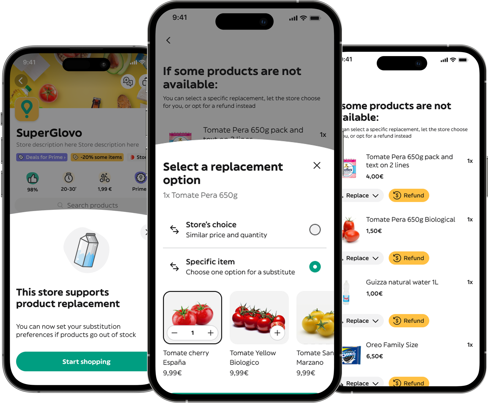
Enabling users to decide what happens when items are unavailable at the moment of collection — reducing friction and rebuilding trust in the grocery shopping experience.
Groceries' #1 pain point: users only learn about missing products after delivery.
Churn and the share of orders affected by missing products were alarmingly high — enough to make this Groceries' most pressing problem.
Smooth across engineering, ops and business. The CPO's benchmark-driven challenges were resolved through research, not opinion.
A clear north star: give users control and transparency over their order before anything goes wrong.
Interviews with 40+ users in iterative blocks of 5, showing evolved designs to each new group.
Most users didn't actually mind having products replaced — they just needed to know it was happening. The real pain wasn't the substitution. It was the silence.
Designing for users who no longer trust availability — a seamless journey covering every touchpoint, from feature discovery to specific product replacements.
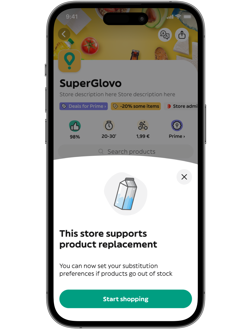
A modal introduces the feature on first access to each store with replacements enabled.
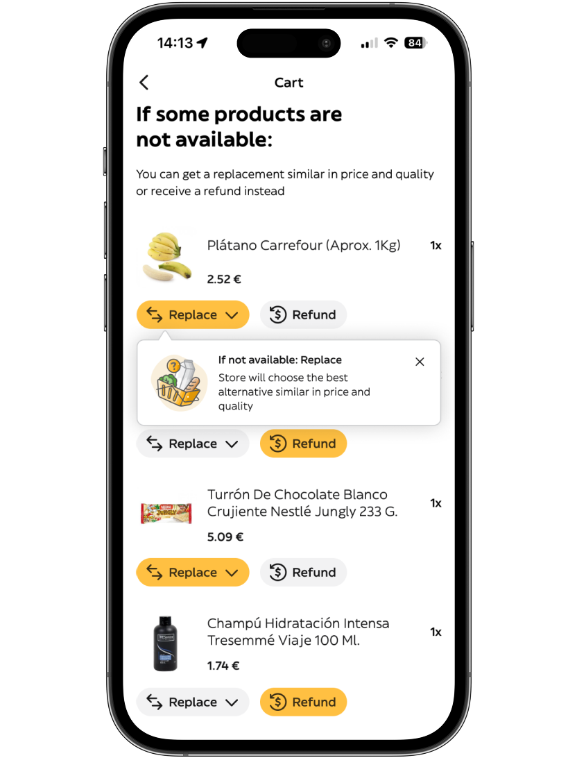
Educational coach marks highlight the available options inside the replacements Hub.
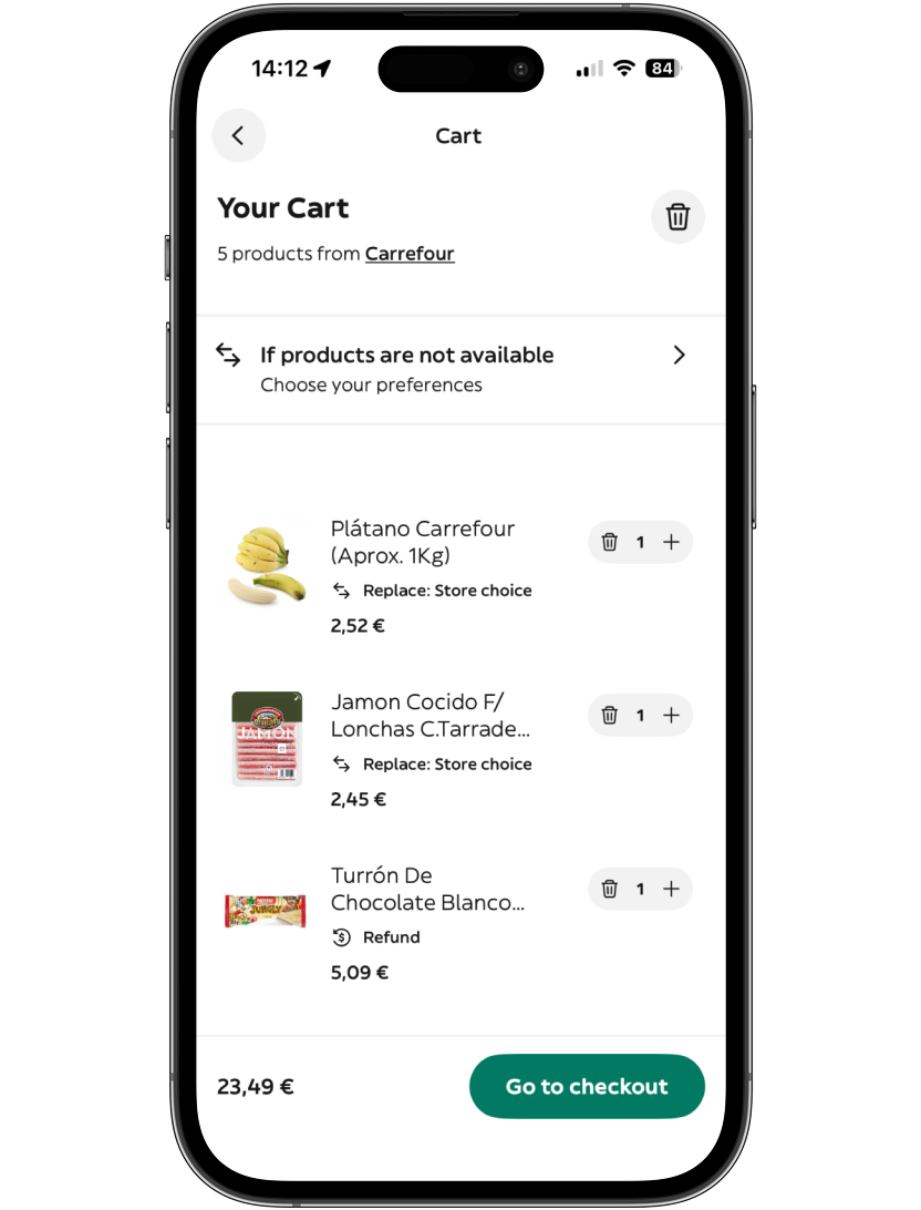
Displayed on top of the product list for maximum visibility, with a summary of choices on each product tile.
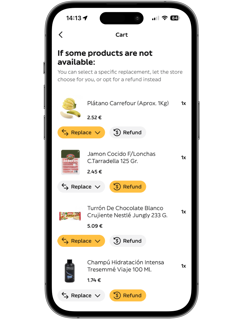
A focused space where users choose the most adequate option for each product.
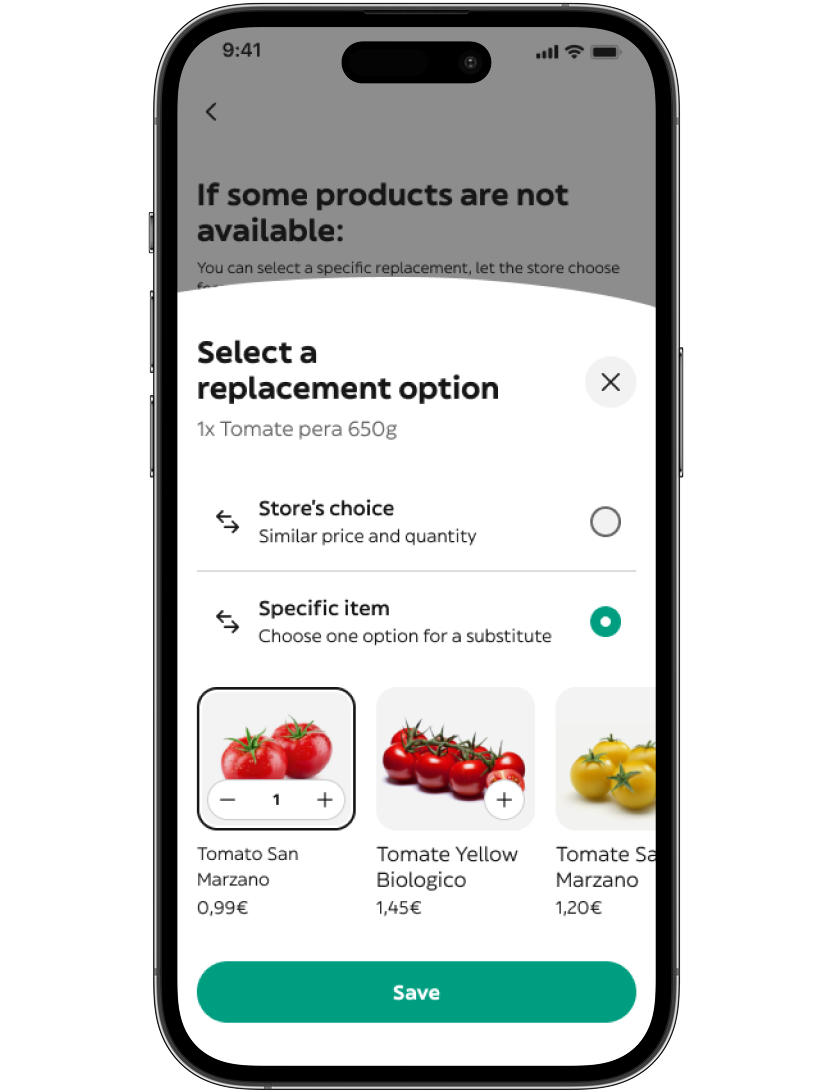
Users decide the exact replacement for each item — or tell the store they can handle it.
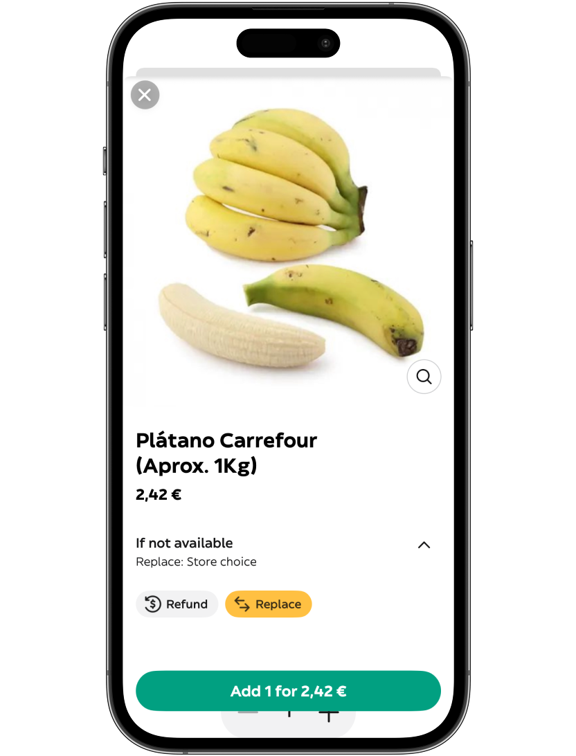
Preferences can also be set from the PDP, covering both main add-to-cart flows.
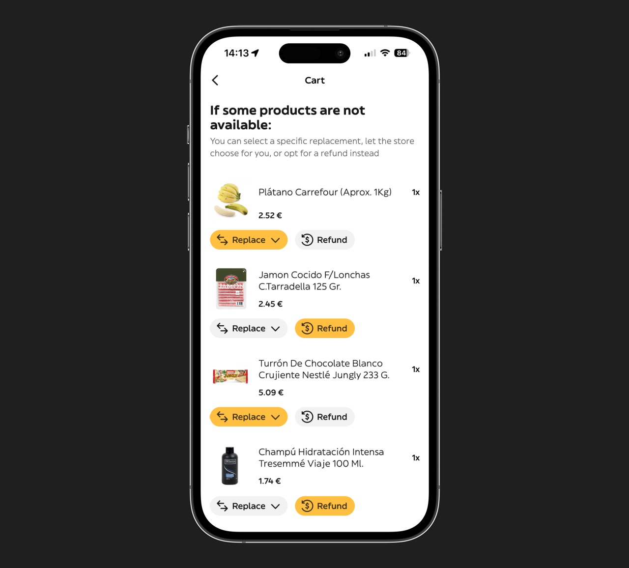
Late in the process, the CPO challenged the finished designs: test a version where replacement choices lived directly in the Cart page. We ran the test — the dedicated Hub won on every metric that mattered.
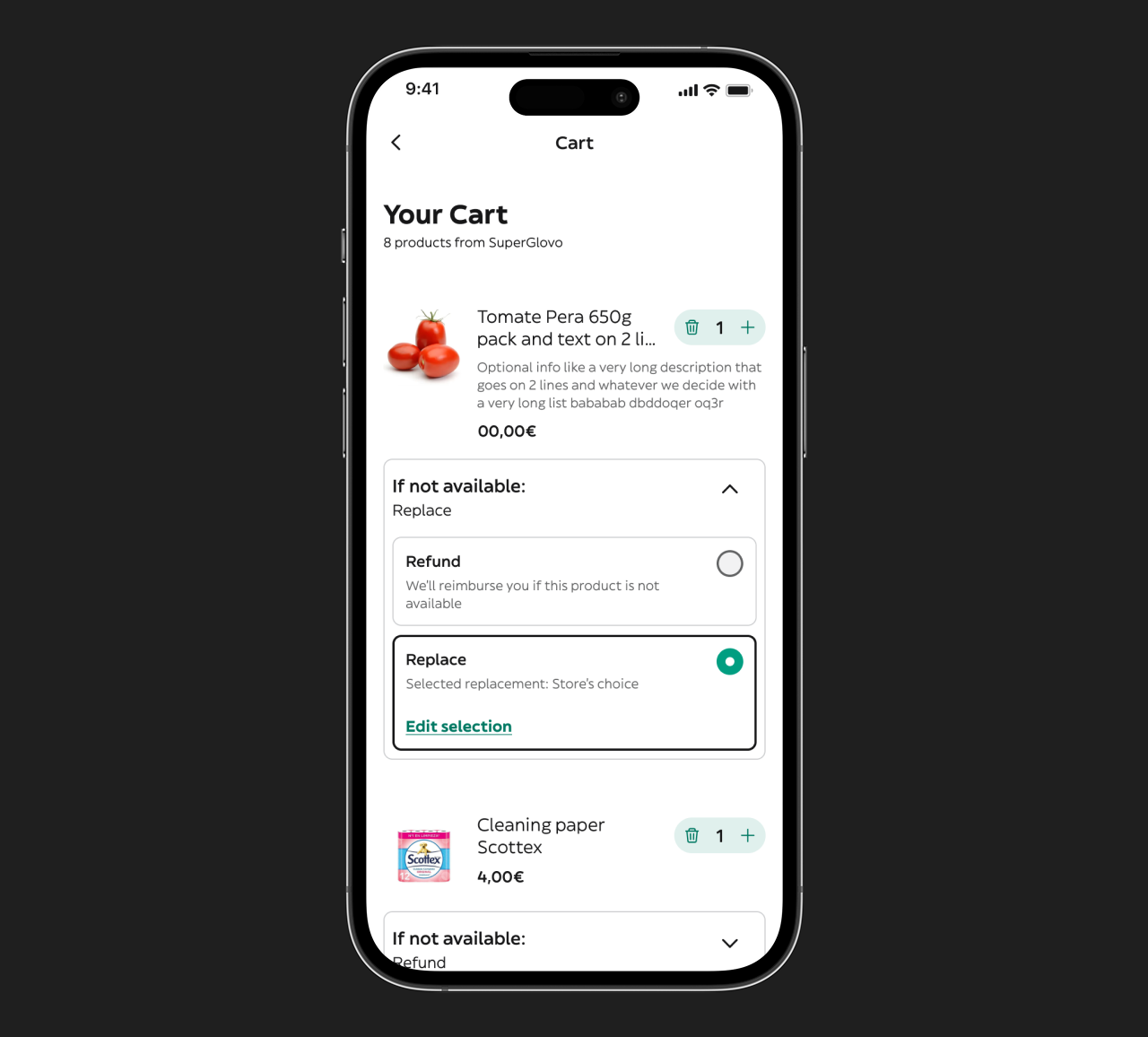
PNA options embedded directly in the Cart page.
PNA options in a separate, focused page.
Visibility and prominence aren't the same thing. A clear, dedicated moment outperformed embedding the feature in an already busy page.
Engineers were involved from the ideation phase, so a big chunk of challenges was already solved by early alignment on context.
Engineering demos · Pull request reviews · Bug bash on staff release